case study 01 · cosmetics e-commerce

Digital Transformation

When I joined Absolute New York, the brand had minimal digital presence, an outdated website, and no structured marketing or analytics strategy. I stepped in as the lead digital designer and strategist — building the team, leading website redesign efforts, producing all digital campaign assets, and launching a structured social media and performance system. This case study highlights how I helped transform Absolute New York’s online presence from the ground up.

Role
Lead Digital Designer & Strategist
Timeline
2024-2025
Industry
Beauty & cosmetics, Ecommerce
Team
2 designer · 1 PM · 2 engineers · 1 Marketing Specialist · 1 VP
00 — overview

I owned the whole digital funnel.

Absolute New York is a global beauty and cosmetics brand serving both retail partners (B2B) and direct consumers (B2C). As Lead Digital Designer, I led a full website redesign, streamlined marketing processes, and developed multi-channel campaign assets that elevated the brand’s online presence and strengthened its market reach.

01 · brand & social

Brand Strategy.

Revamped an underperforming social media strategy using UGC and influencer collaborations, driving stronger brand awareness.

02 · campaigns

Ran the campaigns.

Produced digital campaign assets across channels, tying launches and promotions into one consistent visual story that drove traffic to the store.

03 · website

Redesigned the store.

Led the full storefront redesign — restructured navigation, modernized the visual language, and rebuilt the path to checkout to convert that traffic into sales.

part 01 · the website

A homepage that points people to product.

01 — the challenge

No Structure, No CTAs

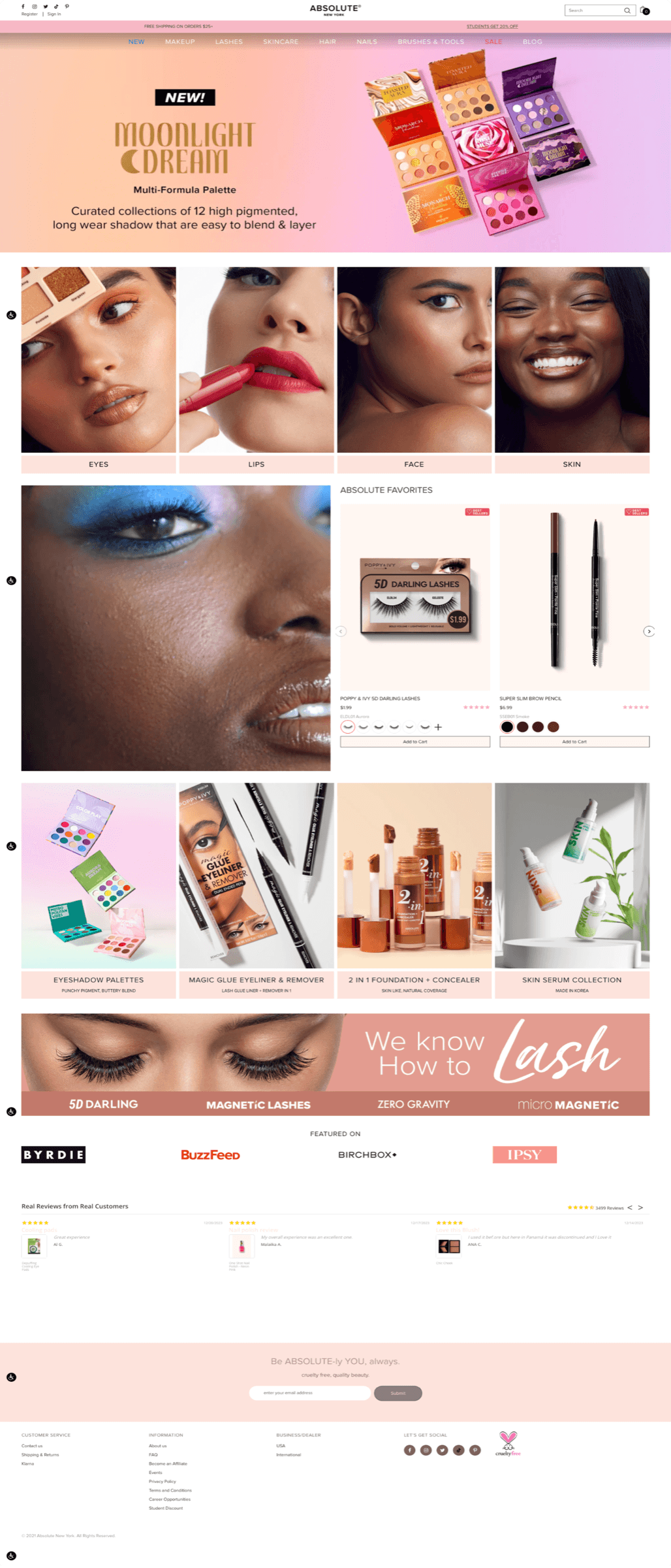
The old storefront looked dated and gave shoppers no clear path to buy. Auditing the homepage, catalog, and checkout surfaced four issues that were quietly draining conversion.

The previous homepage — 2023.
  1. 01

    No clear calls to action

    The homepage had no CTA buttons or user-flow logic — nothing guided shoppers toward the next step.

  2. 02

    No browsing structure

    There was no visible way to browse categories, bestsellers, or new arrivals, so finding a product meant guessing.

  3. 03

    Inconsistent visual language

    Design elements felt jumbled and off-brand, undermining trust before a shopper ever reached a product.

  4. 04

    Drop-off at the top

    Most customers left without scrolling past the hero — the page gave them no reason to keep going.

02 — research

Competitive Research

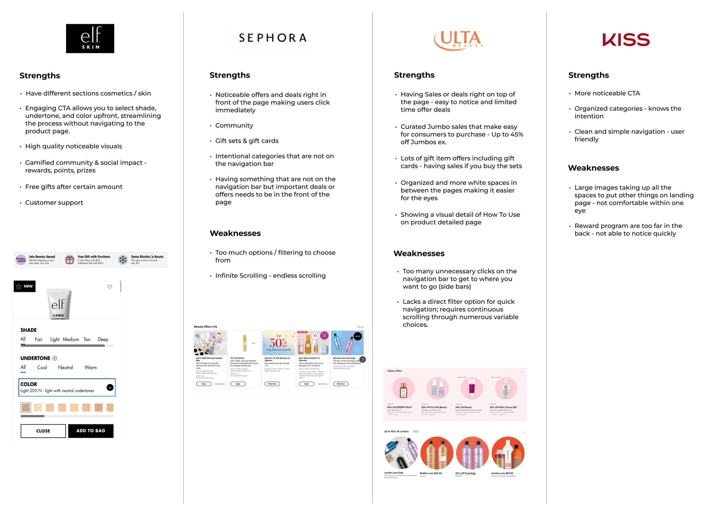
To inform my redesign approach, I conducted a competitive analysis of Sephora, Ulta, e.l.f., and Kiss — evaluating how each handled navigation structure, promotional visibility, CTA placement, and catalog organization. Given that Absolute New York housed multiple sub-brands within one storefront, I paid particular attention to how larger multi-brand retailers organized complex catalogs without overwhelming the user.

Based on this research, I decided to restructure the site around a clean, category-based navigation — organizing products by type rather than sub-brand — so that customers could find what they needed based on their own shopping intent rather than needing prior knowledge of the brand's portfolio. The redesign also introduced consistent CTAs throughout the experience and refreshed the visual language with updated imagery and banners to modernize the overall feel.

03 — the solution

Three moves that gave the homepage a job.

I focused on the entry point. Instead of touching every screen, I rebuilt the homepage and navigation so a first-time visitor instantly knew what the brand sold and where to click next.

solution 01

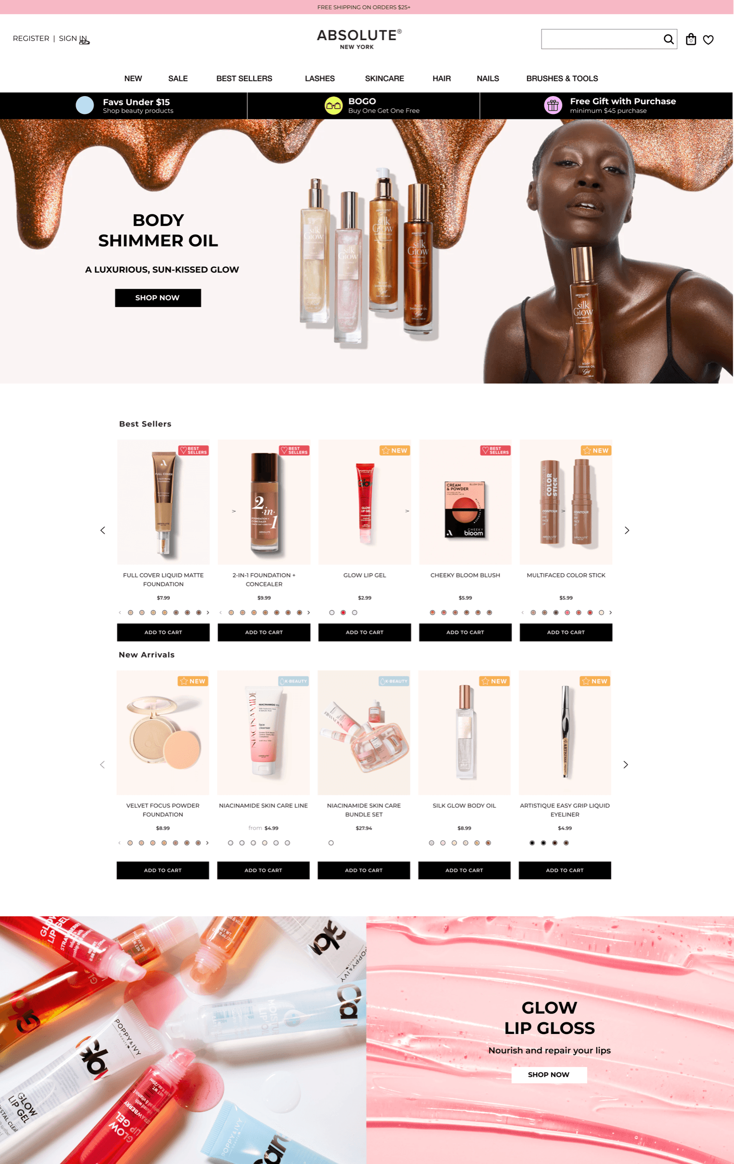
Category-based navigation.

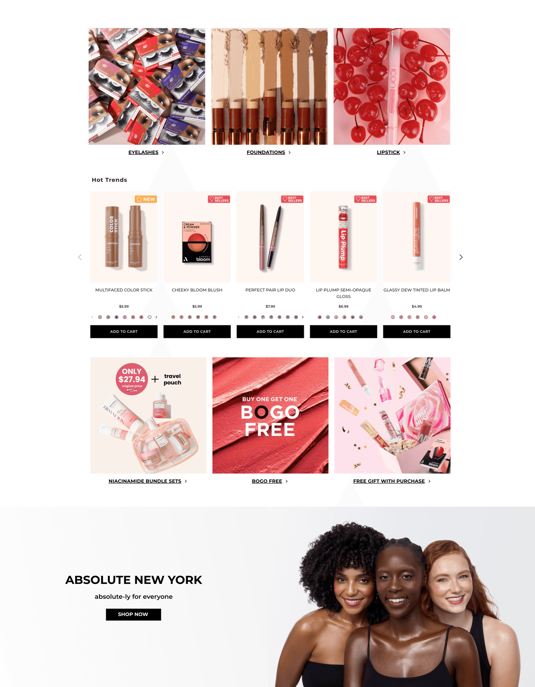
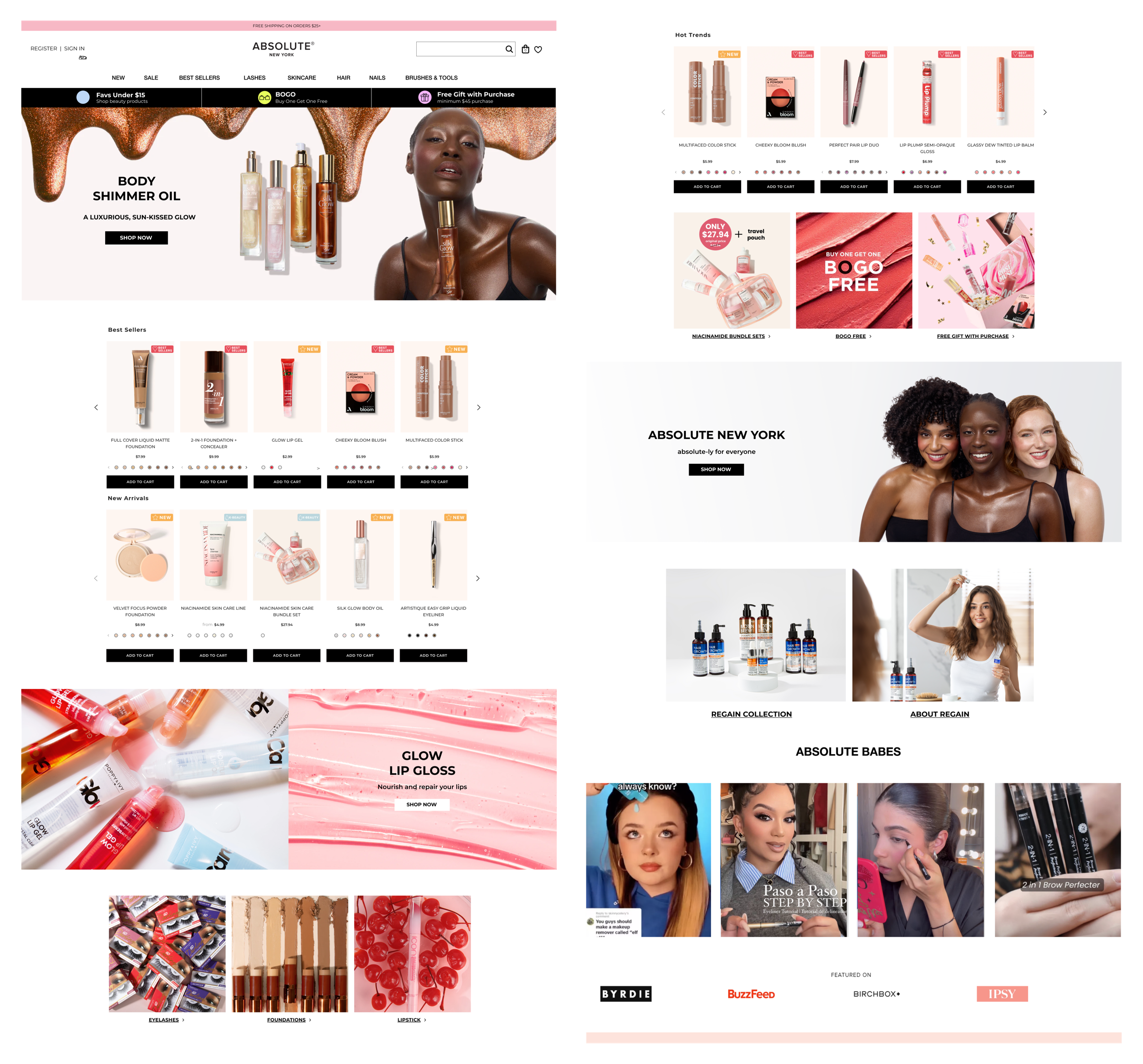
I reorganized the catalog by product type instead of sub-brand [lips, eyes, nails] so customers could shop by intent. I also simplified the navigation bar to make categories easier to scan and reach in one click, and added a promotional strip (stock up & save, BOGO, free gift with purchase) front and center to give shoppers an immediate reason to buy.

solution 02

A homepage with structure and clear CTAs.

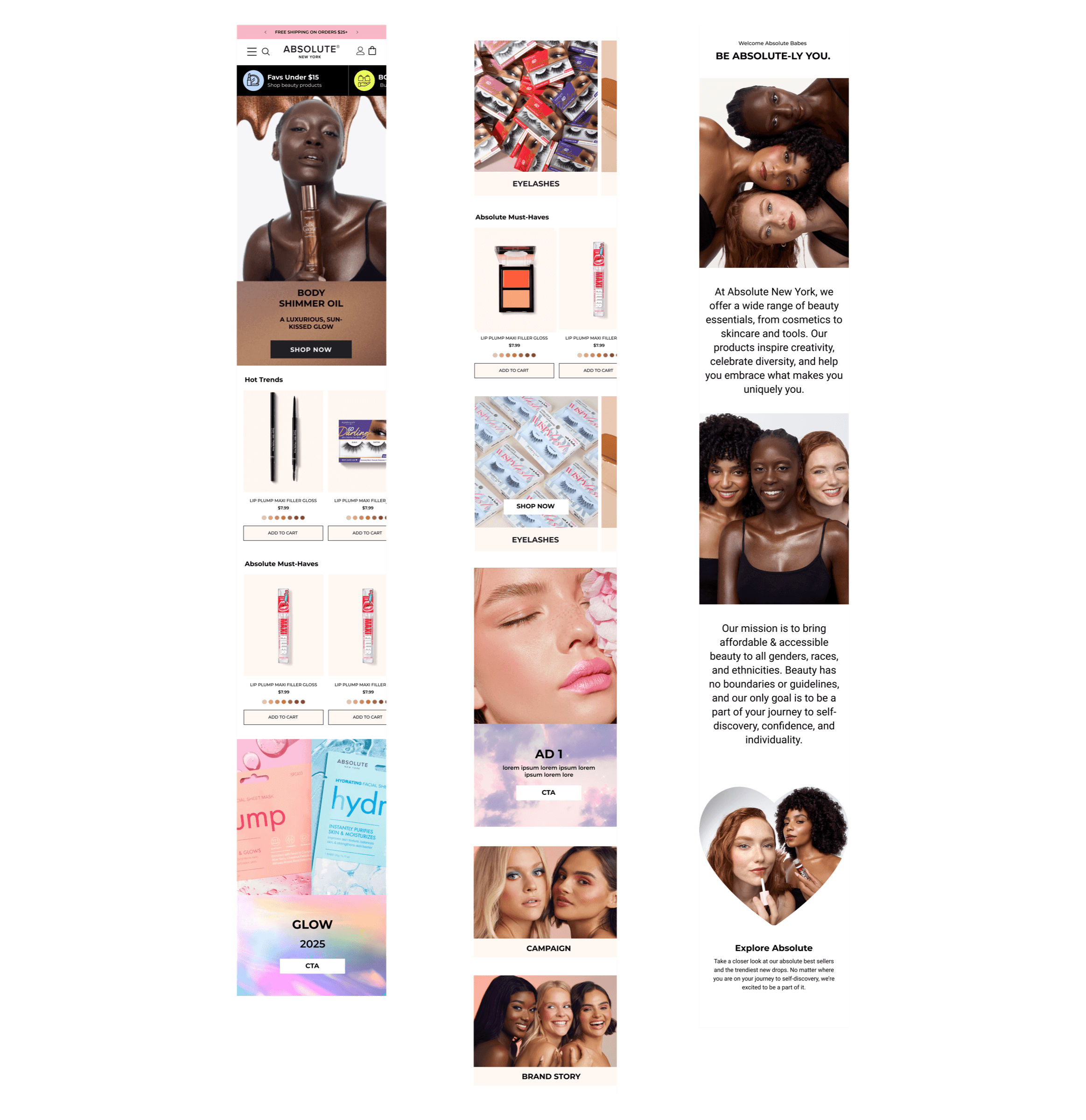
I gave the page a real hierarchy — featured categories, bestsellers, and new arrivals — with consistent calls to action that guide shoppers from landing straight into product, instead of leaving them stranded at the top.

solution 03

A refreshed visual language.

Updated imagery, banners, and a consistent type and color treatment modernized the storefront — making the brand feel current and trustworthy the moment the page loads.

04 — final design

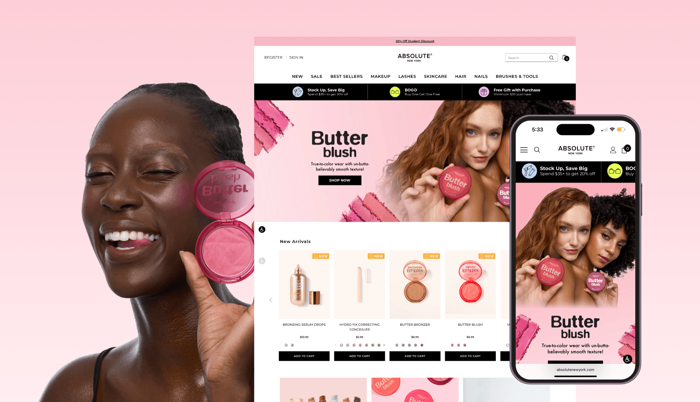
The shipped work.

05 — execution

How I actually shipped it.

I ran the research, designed the screens, built the brand and campaign creative, and handed off a clean spec to the developers — then stayed in the loop through launch.

01
Research
Competitive teardown, site audit, and funnel review.
02
IA & structure
Category-based navigation and homepage hierarchy.
03
UI & visual
Homepage, CTAs, banners, and a refreshed visual language.
04
Brand & campaigns
Social strategy, UGC, and multi-channel campaign assets.
05
Handoff & launch
Dev-ready specs, QA in build, and post-launch tuning.

What I delivered

  • Redesigned homepage & navigation — restructured layout, category system, and CTAs, shipped to production.
  • Refreshed visual language — imagery, banners, type and color applied across the storefront.
  • Campaign & social creative — multi-channel assets for launches and promotions, plus an ongoing social system.
  • Developer handoff — annotated specs and assets, with design QA through launch.

Tools & skills

figmaux researchinformation architectureui designvisual / brand designsocial strategycampaign designphotoshopillustratordev handoff
06 — impact
-31%
homepage bounce rate after relaunch
+23%
YoY revenue growth
+39%
conversion rate (post-relaunch)
07 — reflection

What I’d carry forward.

This project taught me how to drive real impact under real constraints. Without a dedicated research budget, I built a lightweight research process — leaning on competitive analysis, customer reviews, and qualitative feedback instead of formal testing — to ground my decisions in real signal rather than opinion. Limited engineering and design bandwidth also sharpened my prioritization instincts: instead of pursuing a full visual overhaul, I focused on the highest-leverage changes — navigation, CTAs, and categorization — that could ship faster and start moving the needle immediately. With more resources, I’d want to add structured user testing and A/B testing to validate decisions with more precision. Overall, this project shaped how I think about design now — not just as craft, but as a business lever, and it’s changed how I approach every project since: start with the constraint, not around it.

off the clock

Hanjee FM.

Designed and built by Hanjee Na.

tune in →
Hanjee FM
889296100104108
80son air
vol
tune